3 Tips To Make Portable Exhibits In New York More Effective
Portable exhibits in New York are some of the best displays for smaller companies. They’re designed to be easy to set up and dismantle and they don’t take up a lot of space, which means they’re ideal for smaller events. To get the most out of your portable exhibits, remember to:
Forget About The Fancy Fonts
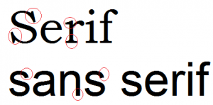
Some companies are drawn to fancy fonts, thinking it elevates the look of their portable exhibits in New York. Most times, however, they just make it harder for your audience to read. Stick to simple, sans serif fonts like Arial, Century Gothic and Helvetica and avoid serif fonts like Palatino and Times New Roman. If you’re not sure whether a font is a serif or san serif font, take a look at the individual letters. If they have tiny ’feet’ on them, the font is a serif one.
Also avoid script fonts like Edwardian Script and Mistral, as these can be extremely hard to read, especially at a distance. Others will come across as unprofessional and may cost you sales, like Comic Sans, Papyrus and Jokerman.
Use A Table Cover To Eliminate Clutter
Your portable exhibits in New York will likely sit on a table, which means you won’t have a floor-length exhibit to stash boxes behind. However that doesn’t mean that you can’t create a space for extra supplies. Instead, make sure that you have a table cover. The right table cover will reach to the floor, creating a space for extra boxes and supplies that are easily accessible, yet out of sight.
Companies have quite a few choices when it comes to table covers. They’re available in a number of personalized colors, which means that you’ll be able to match one to your company’s logo and signature colors. Additionally, it’s even possible to have it silk-screened or imprinted with your logo for an even more personal look.
Use Professionally Created Graphics With One Major Image
Since portable exhibits in New York are typically smaller than other types of displays, it’s important that you use your graphics correctly. You should have your graphics professionally designed by a company that’s well-versed in graphics for portable exhibits in New York, and these graphics should typically include just one major photo or image. Text should be used sparingly – bullet points, rather than large blocks of text – are preferred to easily get your point across.
If you’re looking for an affordable exhibit that doesn’t take up a lot of space, call Watson Productions for more information.


